Clients often approach me, paint decks fanned out like tarot cards, pleading for a color prophecy: Is sage still in? Can I pull off plum in a north-facing room? My answer rarely involves trends or Pantone® forecasts. Instead, I point outside the window and say, “Follow the birds.”
Birds have perfected color placement over millions of years. A robin tucks its pumpkin-orange belly against cool gray bark; a goldfinch pairs saffron feathers with leafy greens; a kingfisher marries electric turquoise to riverbank clay. These tiny designers know instinctively what many humans forget: vivid hues are most powerful when balanced by nature’s neutrals and anchored to context.
Start with a Nesting Neutral
Every nest begins with a base: twigs, mud, or grasses—earth tones that ground brighter accents. Your home needs the same. Choose a neutral that feels authentic to your architecture: warm limestone beige in a pre-war, crisp dove gray in a contemporary condo, or muted greige in a loft. This “twig tone” forms a backdrop so bolder colors can pop without overwhelming.
Happily Ever Always™ Tip: Paint large surfaces—walls, ceilings, even built-ins—in one cohesive neutral to let accent pieces sing.
Add One Confident Hue—Your “Plumage”
Birds flaunt a single statement color for attraction and identity. Likewise, pick one shade that thrills you and repeat it strategically. Love cobalt? Introduce it through velvet throw pillows, a lacquered tray, and perhaps a lampshade lining. Keep the dosage under 20 percent of the room’s visible palette; the restraint gives your accent hue the same punch as a cardinal’s red in winter branches.
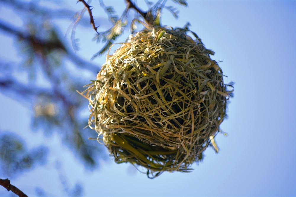
Build Texture Before Adding More Color
Many birds weave softness—feathers, moss, bits of cotton—into their nests for insulation and interest. Translate that layering by introducing texture: boucle upholstery, hand-woven baskets, ribbed ceramics. Texture provides visual depth so additional colors won’t feel flat or fight for dominance.
Borrow Secondary Hues from Surroundings
Notice how a hummingbird’s iridescent emerald echoes jungle foliage or how seaside terns blend chalky white with sand-toned wings. Take cues from what’s outside your windows: lake blues, city-brick reds, or park-leaf greens. These environmental links create harmony between interior and exterior, making rooms feel rooted rather than random.
Use White (or Black) as Negative Space
White is the still sky behind a soaring hawk; black is the shadow that defines a swan’s curve. Employ these extremes sparingly—white trim to frame walls, black hardware to punctuate cabinetry. Negative space lets eyes rest and elevates every other color, just as silence heightens birdsong.
Test Like a Songbird
Birds constantly adapt nests—adding a ribbon here, a lichen tuft there—until form meets function. Apply the same experimentation: pin fabric swatches, prop art, live with color samples for 48 hours. Morning light may flatter a hue that evening shadows mute. Let the palette evolve rather than forcing a final decision in one afternoon.
Final Flight
Color isn’t about bravado; it’s about balance, story, and joy—qualities birds embody effortlessly. Next time you’re tempted by a trend, step outside. Let a goldfinch, gull, or even a humble sparrow tutor you in palette harmony. When nature becomes your designer, your rooms will sing Happily Ever Always™—season after season, trend after trend.